& Web Designer • Illustrator
Creativity Map
Services
UX/UI Design, Data Visualization,
Web Design, Interaction Design
Role
Researcher,
UX/UI Designer
Collaborators
Emma Prushan, Hanna Zelcer,
and Annika Zitto
Overview
The Creativity Map is an interactive web-based platform developed to showcase the diverse creative projects across all disciplines at Jefferson's East Falls campus. Funded through a grant from Jefferson's Creativity Core Curriculum, this project aims to demonstrate how creativity transcends disciplinary boundaries and contributes to meaningful innovation. The website serves as a comprehensive repository where users can explore creative endeavors organized by their goals and impact, making the rich history of creative work at Jefferson accessible to both targeted users seeking specific information and exploratory users interested in discovering the breadth of campus creativity.
Challenge
The primary challenge was creating an intuitive and engaging platform that could effectively organize and present Jefferson's diverse creative projects across multiple disciplines, time periods, and goals. The system developed would have to accommodate both users who knew exactly what they were looking for and those who wanted to freely explore. Additionally, establishing meaningful categorization methods that reflected the true nature of creative work at Jefferson while remaining flexible enough to accommodate the university's evolving landscape was essential. The solution needed to be visually compelling, technically feasible, and capable of handling complex filtering and navigation requirements.
Research and Analysis
The research methodology involved conducting interviews with professors, faculty, and students, alongside archival research and analysis of Jefferson news resources. Through this process, the team discovered that creative projects across the campus shared common goals and placed significant emphasis on their end impact rather than solely on their discipline.
This insight led to organizing projects by what they aimed to accomplish, including categories such as Health, Education, Social Equity, and Sustainability. The team identified two primary user types that would benefit from the platform: targeted users who seek specific information and exploratory users who want to discover connections across disciplines.
Ideation and Concept Development
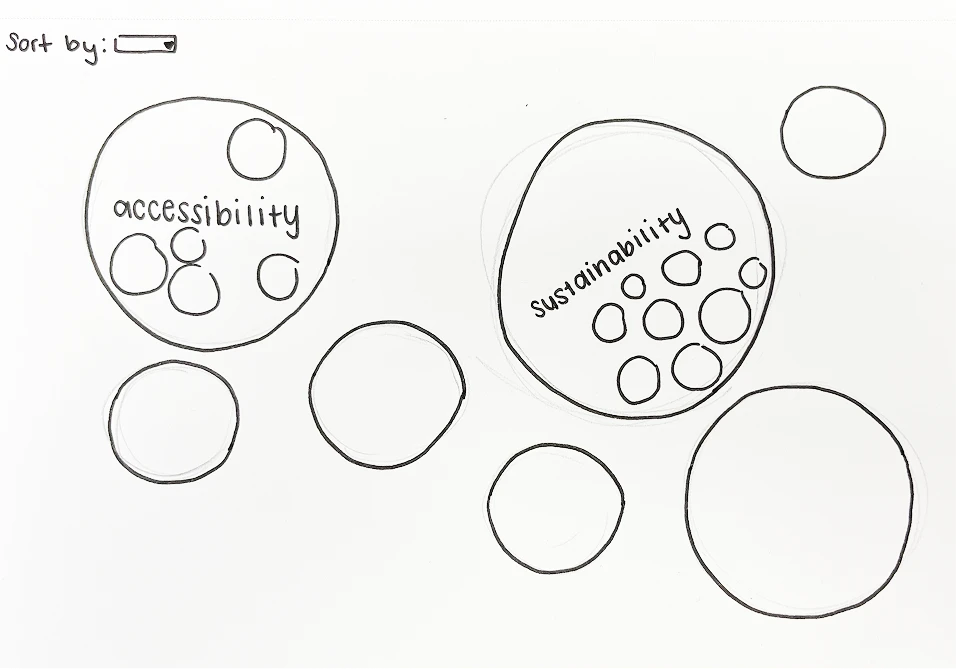
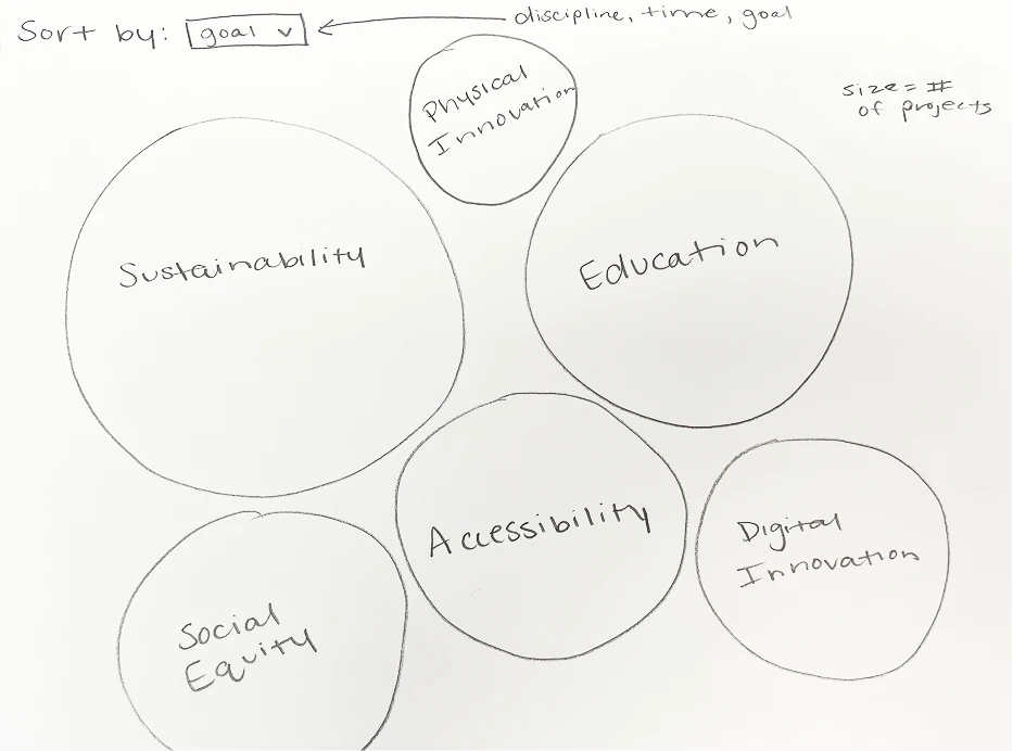
During the ideation phase, the team initially explored the concept of nested circles to represent the relationships between creative projects. However, after evaluating the coding complexity and user experience implications, they pivoted to a clustered bubble chart approach that would be more technically feasible while maintaining visual appeal.
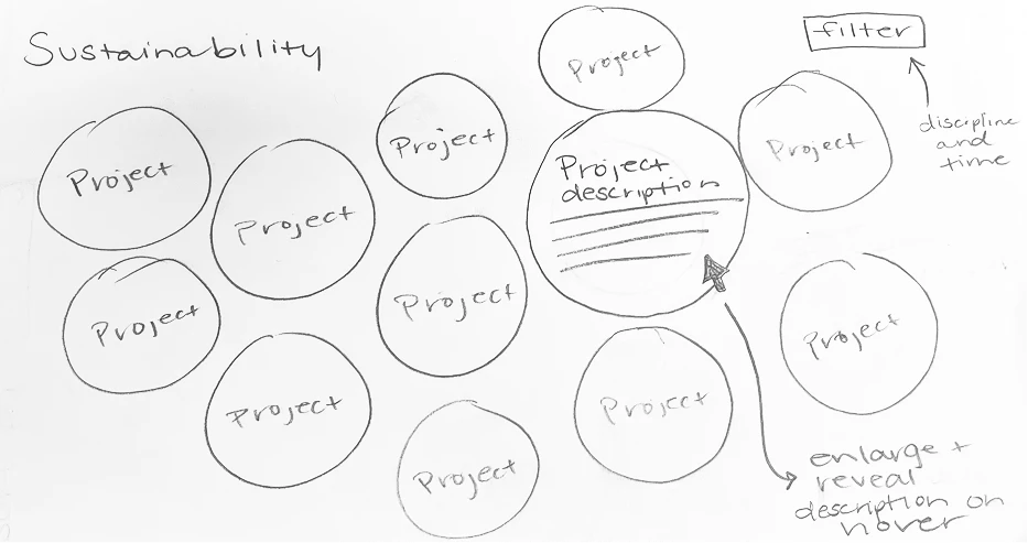
This evolution in thinking allowed the team to develop a more interactive and scalable solution. The concept was refined further to include a system where bubble sizes would reflect the number of projects within each category, and designed interactions where users could click bubbles to reveal more detailed project information. The interface was designed to be fully interactive, with bubbles expanding on hover to reveal brief project descriptions before users commit to clicking through for full details.
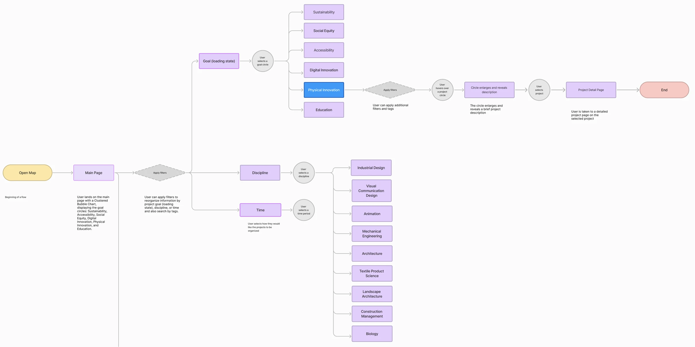
User Flow
The team developed a comprehensive user flow to accommodate both targeted users seeking specific information and exploratory users wanting to discover connections. The journey progresses from the main clustered bubble chart through goal-specific pages to detailed project information, with hover and click interactions revealing increasing levels of detail.
By mapping out these interaction patterns early, the team ensured the complex filtering and navigation requirements could be implemented intuitively, creating multiple pathways through the content to serve diverse user needs.
Low-Fidelity Prototyping
Preliminary sketches explored various approaches to visualizing the relationships between creative projects, initially focusing on nested circle concepts before transitioning to the clustered bubble chart model. These low-fidelity prototypes helped the team test the viability of their filtering system and navigation structure, ensuring that users could seamlessly move from the main goal categories to specific project pages.
Through iterative sketching, the basic framework was established for how bubble sizes would communicate information about project volume and how interactive elements would guide users through their exploration.
Visual Design
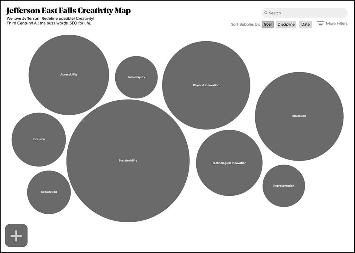
The visual design system was developed to support intuitive navigation and clear information hierarchy. A comprehensive UI kit included button styles with default and hover states, sorting mechanisms for filtering, and a tag system that displays basic project information with color-coded goals.
The navigation system became the most important feature of the website, designed with an expanded nav bar that provides dropdown access to all goals, disciplines, and time frames when users hover over the "discover" option. This approach ensures users can access any information or section directly from wherever they are on the site.
Color Palette
The color palette drew inspiration from Jefferson branding, featuring neutrals like Jefferson navy and light blue, alongside category-specific colors carefully selected to match each goal's theme. A critical design decision involved using color to differentiate goals, as the team determined this category was smaller and less likely to fluctuate than majors or disciplines throughout the university's diverse history.
Typography
Typography also drew inspiration from Jefferson's brand guidelines, utilizing Noe Display, Noe Text, GT Haptik, and Museo Sans to create visual consistency with the university's identity.

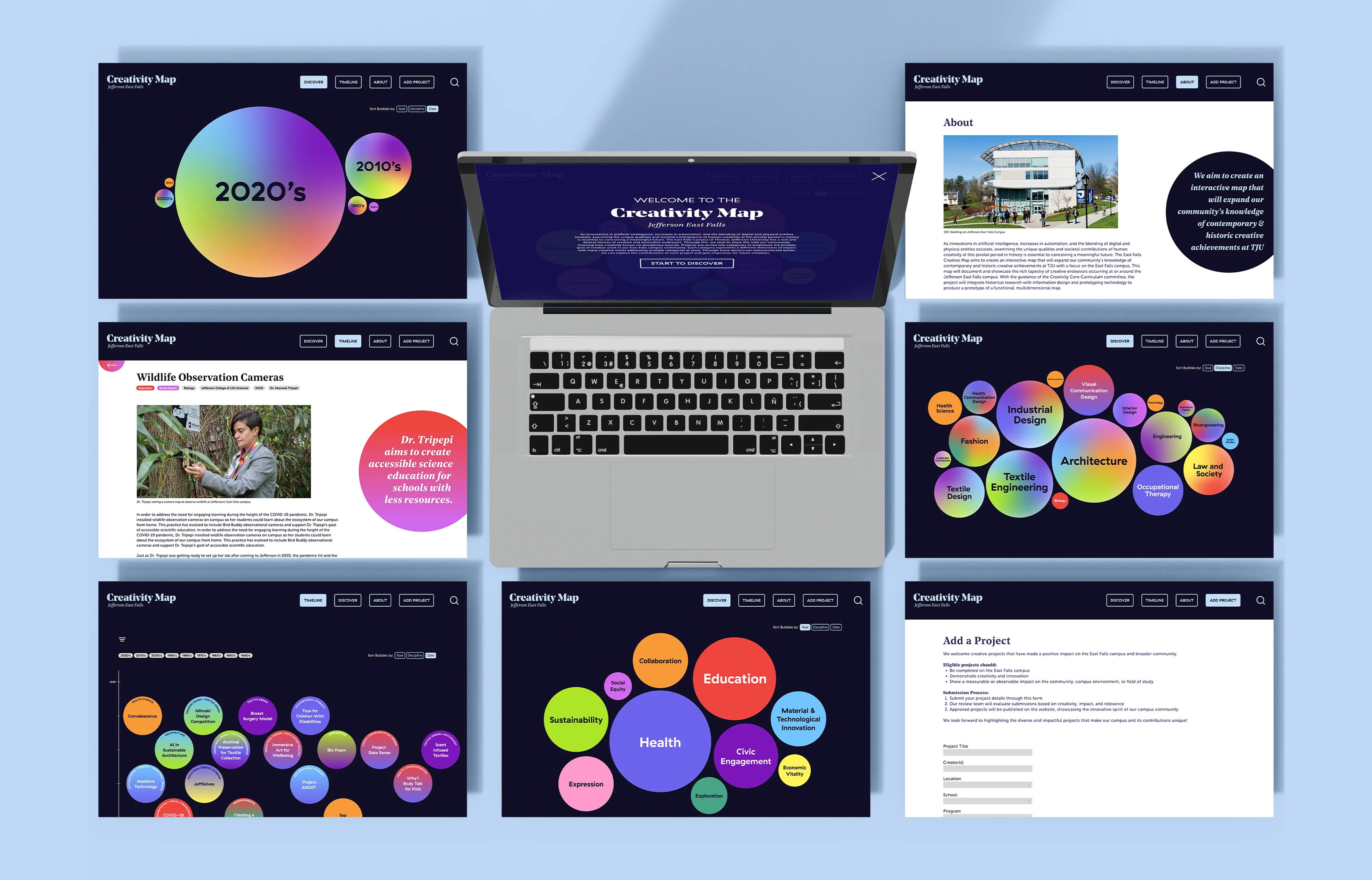
Final Prototype
The final prototype is an interactive website centered around a clustered bubble chart visualization that allows users to filter projects by goal, discipline, and time.
Clustered Bubble Chart Visualization
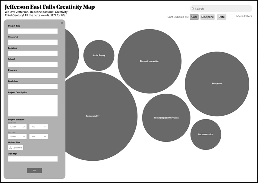
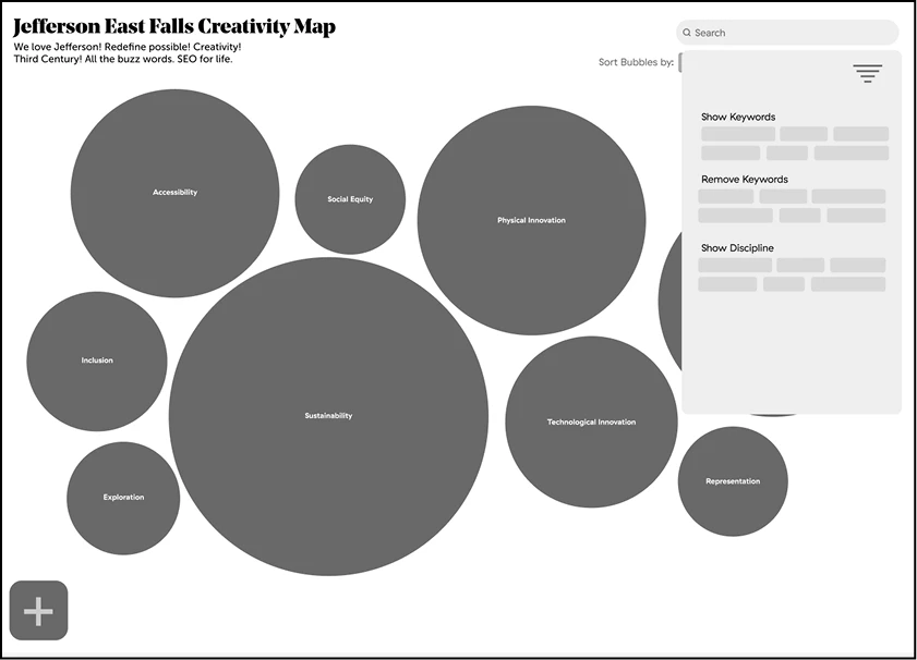
A welcome page introduces the Creativity Map project and its mission to showcase creative work across Jefferson's East Falls campus. After learning about the project's purpose, users click a "Start to Discover" button that takes them to the main clustered bubble chart, where each circle represents a primary goal category. Users can filter the entire visualization by goal, discipline, and time to customize their exploration experience.
Goal-Specific Navigation
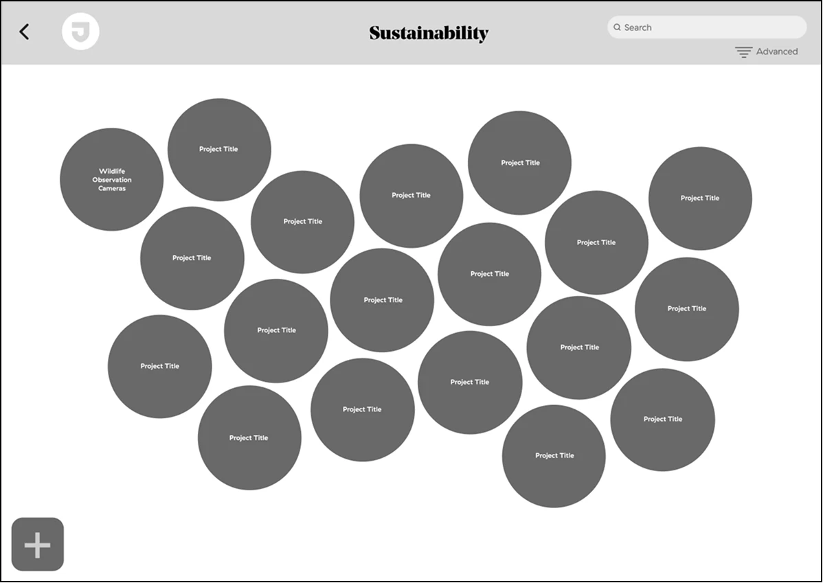
Hovering over the goal circles reveals the definition of the category, providing context before users click for full details. When users select a circle from the main page, they navigate to a dedicated page where individual projects within that goal are displayed as interactive circles on a timeline.
Interactive Timeline
A visual timeline allows users to explore projects chronologically, showing both project evolution and completion dates. This feature helps users understand the development of creative initiatives across different time periods at Jefferson.
As users hover over a project circle, it expands to reveal the description of the project.
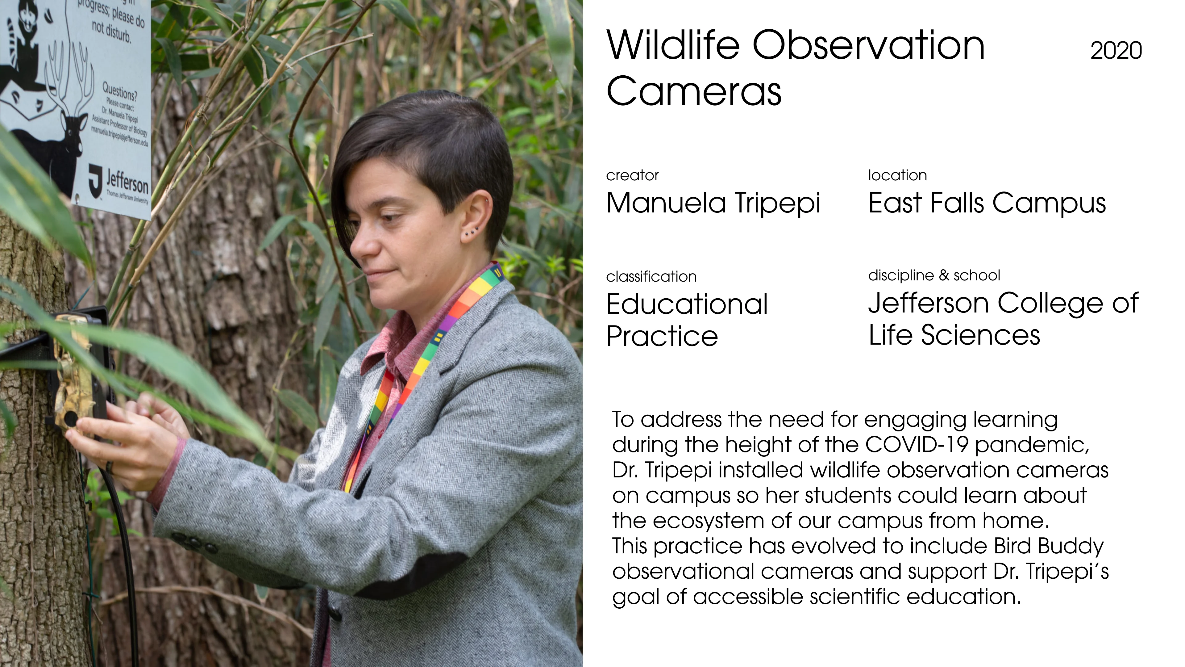
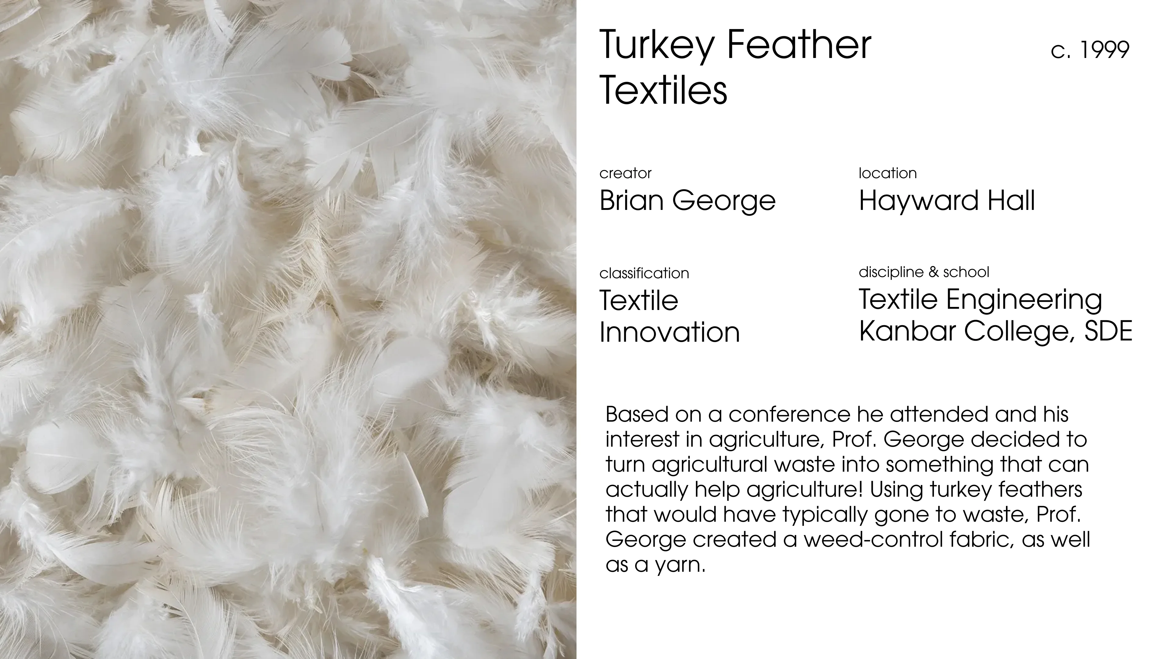
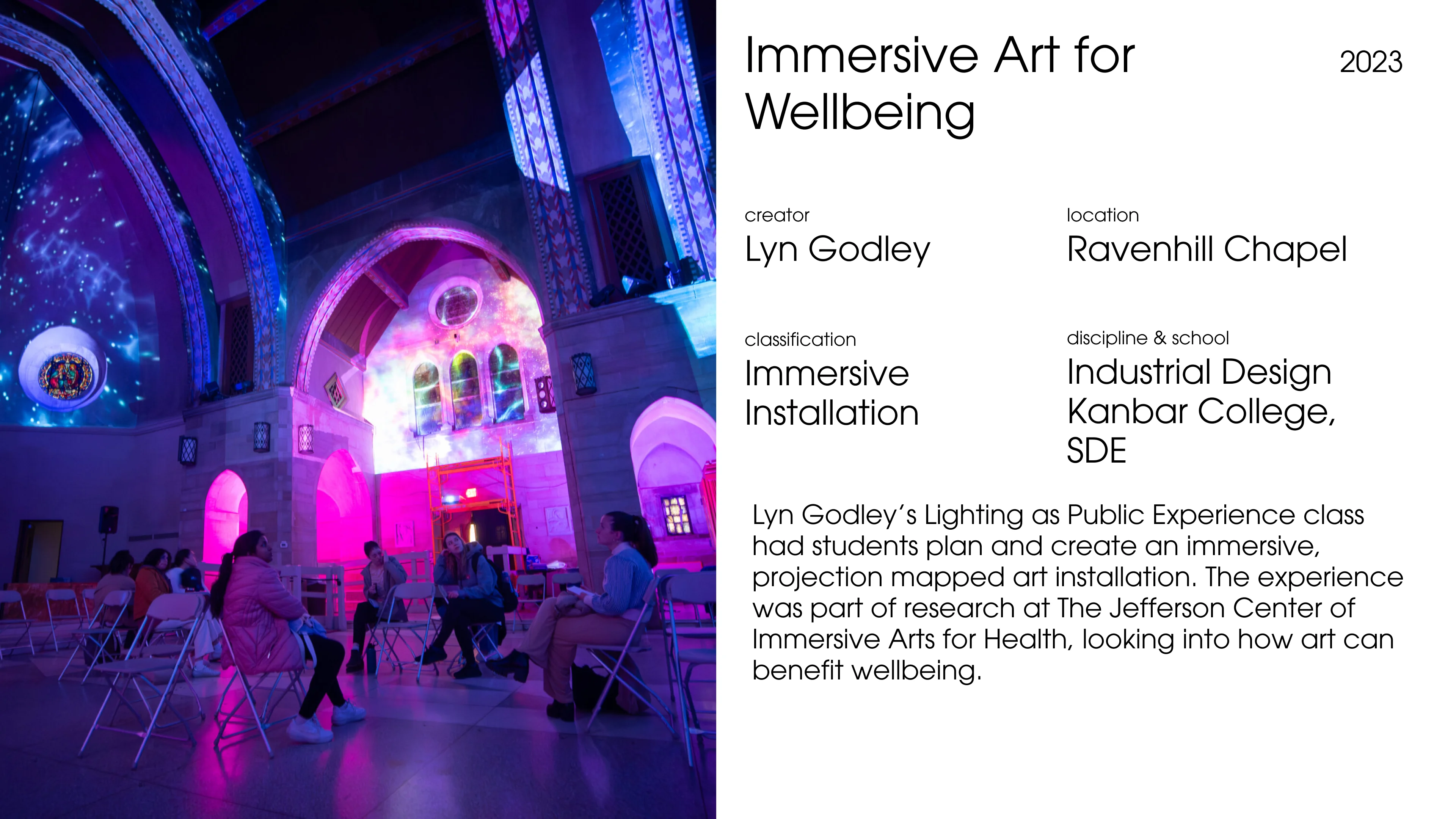
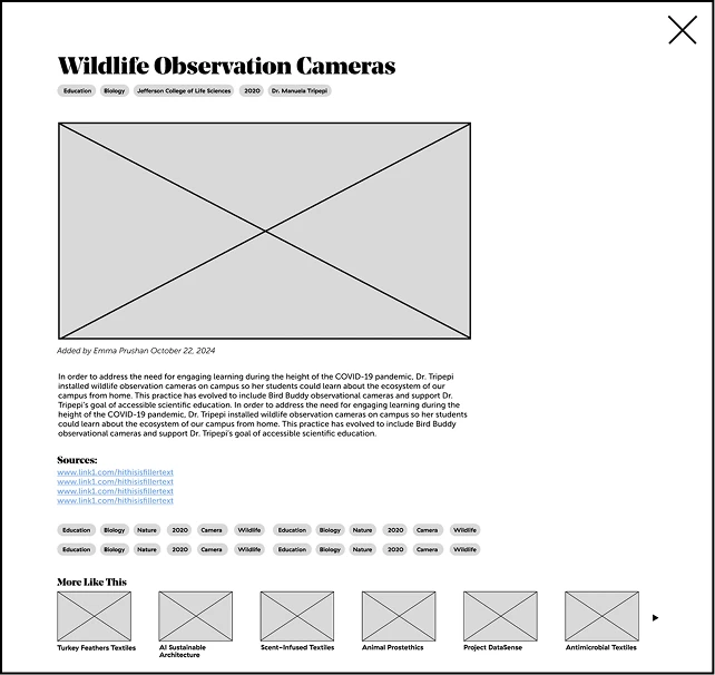
Project Detail Page
Clicking on a project circle takes users to a detailed project page with comprehensive information about the creative work. The page features a sources section where users can access related documentation, research materials, and references.
A "More Like This" section suggests related projects based on shared goals, disciplines, or themes, helping users discover connections across different creative initiatives and understand how they intersect and build upon one another at Jefferson.
Global Navigation System
An expanded nav bar provides dropdown access to all goals, disciplines, and time frames when users hover over the "discover" option. This navigation system ensures users can access any information or section directly from wherever they are on the site, creating a seamless browsing experience regardless of their current location within the platform.
About Page
The About page serves as the contextual foundation for the Creativity Map, articulating its mission within the broader landscape of technological advancement and human innovation. It positions the project not just as a catalog of creative work, but as a deliberate response to a pivotal moment in history where defining and celebrating human creativity becomes essential.
Add a Project Page
The "Add a Project" page represents a critical component of the Creativity Map's mission to create a living, evolving archive of creative work at Jefferson. This crowdsourcing feature transforms the platform from a static repository into a dynamic, community-driven resource that grows alongside Jefferson's creative community. By inviting students, faculty, staff, and alumni to submit their own projects, it ensures that diverse voices and initiatives across all disciplines are represented.
Reflection and Impact
This project successfully demonstrated how digital technology can enhance the user experience without overwhelming the content. The multi-platform approach ensured the platform reaches various audiences, extending access to the entire Jefferson community.
Key learnings included the importance of designing for diverse user groups simultaneously while maintaining a cohesive experience, and the challenge of balancing ambitious interactive concepts with realistic technical implementation timelines. The project reinforced that effective platform design requires deep understanding of both subject matter and diverse audience needs, with user personas serving as crucial touchstones throughout the design process.
©2026 Anna J. Leonard. All Rights Reserved.